Two Very Different Stories Behind the Two New Sports Logos in Las Vegas
By ALAN SNEL
It’s a tale of two sports logos in Las Vegas.
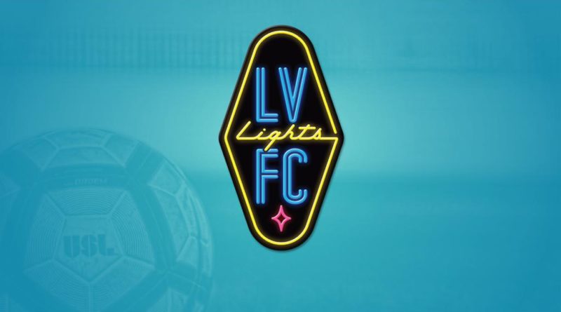
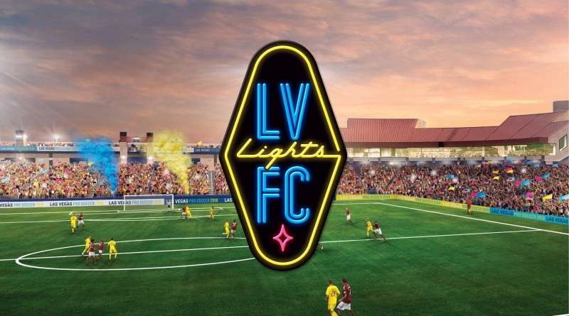
One was just released Monday and widely hailed for its direct simplicity in its message. It’s the inaugural logo of the Las Vegas Lights FC soccer team, which begins play in the United Soccer League in 2018.
The other was mostly panned for being too cluttered and too busy only a few months ago when it was unveiled to the public. It was the new UNLV logo that was criticized for cramming too many elements into the mark.
There was even a map-like graphic explaining the UNLV logo’s features. As the saying goes, if you have to explain a logo, it’s probably not the greatest logo.
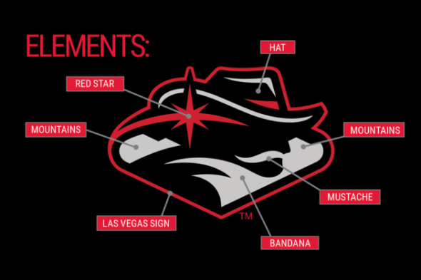
Interestingly enough, both contained a similar feature — the Las Vegas welcome sign shape.
But the Lights did something original with it by rotating it 90 degrees and making it vertical. The new UNLV logo kept the horizontal welcome sign look.
There were two very different design processes at work here.
UNLV had an out-of-market designer in Colorado create its new logo. The university did not ask the public for ideas or suggestions.
But the Las Vegas Lights used an in-house artist with three local Las Vegas graphic designers to conceive their mark. The team has been very proactive in accepting locals’ suggestions and integrating them into the brand. For example, the idea of rotating the Las Vegas welcome sign 90 degrees and using a vertical look was a fan’s idea, Las Vegas Lights owner Brett Lashbrook said Tuesday.
“It was 100 percent important,” Lashbrook said of using local fans and graphic artists in Las Vegas to create the logo. “When it comes to brand identity, no one knows a market better than itself.”
The UNLV logo appears as if too many elements were crammed into the design, while the Lights stuck to a very simple design emphasizing the neon lights theme and bright city logo colors. The pink diamond in the Lights logo was inspired by the city of Las Vegas’ logo, Lashbrook said.
Both logos have since taken different paths.
A half-hour after the Las Vegas Lights released their team’s new inaugural logo, Lashbrook was on the local CBS TV affiliate morning news show touting the mark. He has since been talking with other local media about the new logo.
The Lights have been hyping the new logo in a video and on billboards in the area. A T-shirt with the new logo was even on sale at the downtown Las Vegas Zappos campus Z Boutique store.
Conversely, UNLV has rarely discussed its new logo and it’s hard to find the new logo on items at local retail locations. LVSportsBiz.com saw the new UNLV logo on ball caps at a Costco store in Summerlin a few months ago. But most UNLV logo gear items being sold show the old logo.
UNLV didn’t follow up with many public comments about its new logo. LVSportsBiz.com sought out UNLV Athletic Director Desiree Reed-Francois at a sponsorship announcement in front of Thomas & Mack Center Aug. 30. Asked about the UNLV’s new logo at the time, Reed-Francois said her department will be “very strategic on how” it will use the new logo and will be “fiscally responsible.”
It should be noted, a university official told LVSportsBiz.com, that the process to create a new UNLV logo began before Reed-Francois began her new gig as UNLV AD June 1
Contact LVSportsBiz.com founder/writer Alan Snel at asnel@LVSportsBiz.com
